Unlike yesterday’s chart which showed real data from the Depth of Kanbanland 2015 survey (which is still open if you want to try the Values-based delivery assessment), this one shows dummy data. I have seen the real thing, but I don’t want to give too much away before I start presenting results at October’s Moscow and Stockholm conferences.
Had this been a survey of our team or organisation, we might infer that:
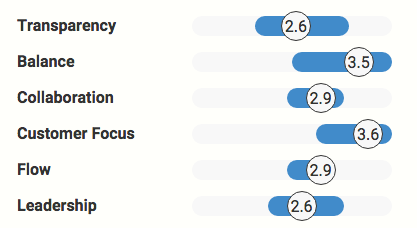
- There is room for optimism on Transparency — we might not be there yet but there are some good things happening
- We’re strongest on Customer focus – yay!
- Balance has the potential to catch up with Customer focus but it looks vulnerable on the downside too. A good place to focus our attention?
- Flow is nothing if not consistent! Even before we look at the prompt-level data we know we must have some consensus in this category. That in itself might be something to build on.
Just for the record (it’s not vital that you know this): Each score is an interquartile mean, the average value of the middle two quartiles (ie the middle half) of that category’s data. To indicate spread, the blue bars cover the range between the means of the lower two and upper two quartiles (the lower half mean and upper half mean, if you wish). I chose these truncated mean statistics for their ability to incorporate plenty of data without being unduly influenced by any one data point.

Blog: Monthly roundups | Classic posts
Links: Home | Partner programme | Resources | Contact | Mike
Community: Slack | LinkedIn group | Twitter
